LondonIndicators
(This graph should update three times daily, once for each curve. The last few values may be subject to some retrospective change as a consequence of the estimation and smoothing algorithms that use future values.)
Description
The purpose of this page is to try to help see how containable the new variant (B.1.1.7 lineage) is. The idea is to take London, a large population which has been affected early and for which the new variant is now dominant, and look at two indicators derived from the Covid Symptom Study run by Zoe, and accompanying swab/PCR tests (known here as "Zoe" for short) in order to get an early idea as possible as to whether the stringent containment measures imposed on 20 December 2020 are enough to prevent growth in infections. This question has a bearing on how bad things are likely to get nationally and worldwide.
The most reliable indicators of virus prevalence are random sample swab/PCR test surveys, and these are carried out for the ONS and for Imperial College London as part of the REACT surveys. Unfortunately there is a long lead time on results from these and I'm impatient to know as soon as possible whether we're going to be overrun by this variant.
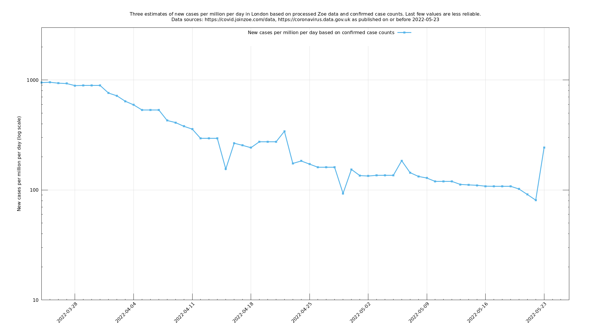
By contrast, Zoe provides two streams of information which, although subject to biases in a way that a random sample survey isn't, should be faster to respond. The two streams are: (i) an indication, from people reporting their symptoms on an app, of how many people at any one time have symptomatic Covid-19 ("prevalence"), and (ii) a rolling swab/PCR-test based survey based on inviting selected app users to take a test, reporting a 14-day average of test results from 18 days before the present day to 4 days before the present day.
Both of these indicators, taken at face value, are influenced by new Covid-19 cases stretching back three weeks or so: they are averages over the recent past. You can attempt to undo these averages to get a more up-to-date result - an estimate of new Covid-19 cases a few days ago - and that is what the purple and green lines in the above graph represent. The blue line is the number of daily confirmed cases in London, as obtained from the official data stream and is included for reference.
You would hope that the purple and green lines are leading indicators and anticipate changes in the blue line (confirmed cases), so you might imagine the blue line shifted to the left to help it coincide with the other lines, but this is not obviously so and I am not going to try to make a definite such claim along these lines. Instead, I'll include a description in the appendix of how these lines were calculated and people can decide how much they choose to believe in them. I am provisionally regarding them as fair indicators, but not infallible.
Conclusion at 1 January 2021

At the time of writing, IF these green and purple curves are an accurate, and IF they are up-to-date enough for the last values to be mostly based on the last 12 days, then we could be in trouble because just flatlining isn't good enough. Bear in mind that roughly 20% of London has already had Covid-19, mostly from the first wave which we expect should give some degree of immunity, so we might expect the growth elsewhere in the country and world will be even more difficult to contain.
Of course the effect of Christmas muddies the waters somewhat. It's possible that the Christmas period causes more (and varied) contacts than usual, but it's also possible that it's the other way around, with schools shut, many off work, and only a minimal Christmas exemption against restrictions on personal meetings.
This simple indicator, LondonTraffic, suggests that traffic on the road has been considerably down from usual since 20 December 2020, maybe comparable to the latter part of May 2020, but higher than in April 2020 where the country was at its most locked down, and Apple mobility data says something similar. So there is perhaps some scope for tightening up, but maybe not a great deal.
Appendix
For the symptom/app-based data (green line), let \[I_t = \text{number of new symptomatic cases between days } t-1 \text{ and } t \text{, for }t=-k+1,\ldots,d\] \[P_t = \text{Estimated symptomatic prevalence at day }t\text{, for }t=0,\ldots,d\] \[T = \text{ recovery time random variable } \sim \Gamma(\text{shape=}2.595, \text{ scale=}4.48)\]
Here $$d$$ is the current day number, $$P_t$$ is Zoe's estimate given to us for current symptomatic prevalence, and $$I_t$$ is what we would like to deduce. The distribution of $$T$$ is taken from Varsavsky et al, December 2020 and $$k$$, the kernel size, is taken large enough to capture almost all of its tail. Given these, we seek to minimise: \[\sum_{t=0}^d \left(P_t-\sum_{i=0}^{k-1}\mathbb P(T>i+\tfrac12)I_{t-i}\right)^2 + \lambda^2\sum_{t=-k+1}^{d-1}(I_t-I_{t+1})^2\]
This is fairly crude stuff but hopefully not too far removed from reality. $$\lambda^2$$ represents the ratio of the variances of the assumed prior normal error distributions of $$P_t$$ and $$I_t$$ from their respective predictors. I would like to say that $$\lambda$$ was chosen in a principled way that maximised the predictive ability of the output, or from knowing from basic biology how much $$I_t$$ can vary from day to day, or something, but I confess I just fiddled around with it until it looked like it was producing something reasonable (neither implausibly flat nor implausibly wiggly to use technical terms) which ended up being at $$\lambda=1$$. (To be fair, varying it a bit didn't make a huge difference.)
For the swab/test data (purple line), let $$I_t$$ be the number of new symptomatic cases, as before, and let
\[S_t = \text{the published number of daily new cases on day }t\text{, for }t=0,\ldots,d\]
Then the operation is essentially the same as above, but with a two-week top hat kernel:
\[\sum_{t=0}^d \left(S_t-\frac{1}{14}\sum_{i=0}^{13}I_{t-i}\right)^2 + \rho^2\sum_{t=-13}^{d-1}(I_t-I_{t+1})^2\]
Here I chose $$\rho=0.2$$. (You'd expect $$\rho<\lambda$$ because daily new cases are lower than prevalence numbers.)