LondonTraffic
About
This was an attempt at collecting an external indication of the level of restrictions society is operating under by looking at the level of traffic congestion in London. I was curious to see what you could glean from a simple measure such as this. The Google Mobility Reports provide a far more comprehensive version of this kind of thing, though this page has the merit of being more-or-less real-time.
London Traffic
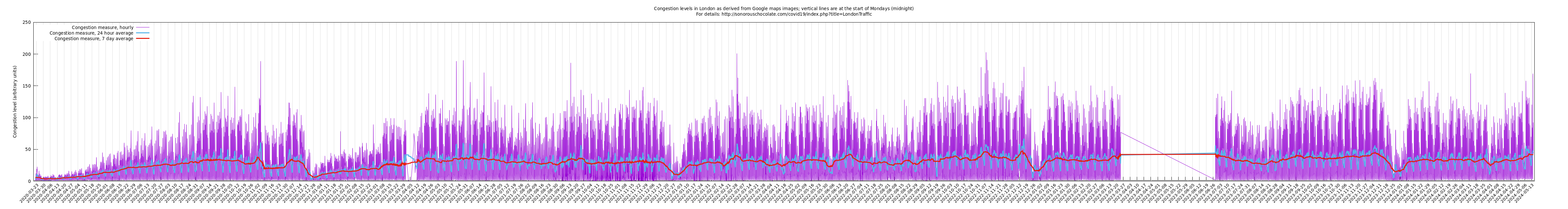
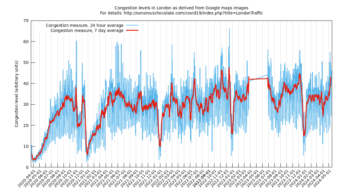
Official Lockdown was introduced in the UK on 2020-03-23 though the actual response to it was a little more gradual as you can see from the graph that week. We see the quietest period the following week: 2020-03-30 - 2020-04-05. From then on there is a gradual increase in activity. Official easing of Lockdown in England began on 2020-05-11, though we can see from the above graph the pattern of rush hour, indicated by spikes in the morning and afternoon, had been establishing itself from at least a week before that. (Friday 2020-05-08 was a public holiday incidentally.)
The above graph is derived from Google map's traffic congestion information as colour-coded in images like this one
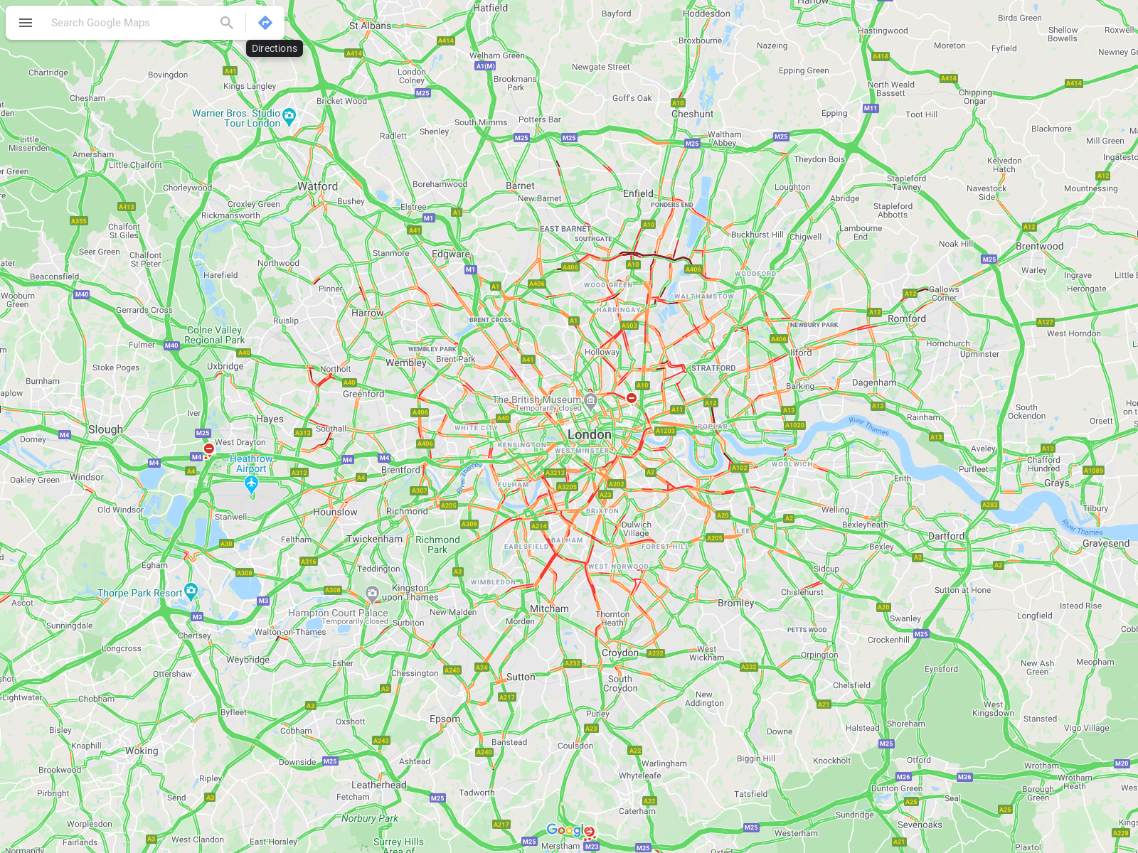
by counting the number of pixels that represent the levels of congestion in Google map's system (green, orange, red, dark red).
The raw data file is available here (updated daily).
The programs used to make it are available in this repository.