UK variant comparison
Self-updating graphs showing current situation
Most of the graphs in this section should auto-update every day or two, according to when there is new sequence data from CLIMB. You may need to hit shift-reload or some such to defeat your browser's cache. This page is a bit of an experiment/work-in-progress in mixing self-updating content, and comments that apply to a particular version of the dynamic content, with static explanations. (The "Time of writing" tags are an attempt to clarify this.)
Note that the number of sequenced samples has been low in recent months which means that the growth rate estimates presented here are uncertain.
Program used for analysis: uk_var_comp.py. See sections below for a description of variant pressure.
[Time of writing: 7 December 2023. Adjusted variant mixture.] This variant pressure graph shows history since 1 September 2023. For comparison with the present graph, the BA.5 wave reached a variant pressure of 0.29%. The reason for showing a relatively short time interval (two months or so) is that the relative growth rates of new variants are changing, presumably due to the background immunity pattern slowly becoming relatively less favourable to the new variants, so a simple straight-line growth estimate (meaning the exponential linear assumption as described in the technical details section) going back too far in time would overestimate the relative growth rates of the new crop of variants. And going too far forward would underestimate future variant pressure because new variants will emerge that are not accounted for here.
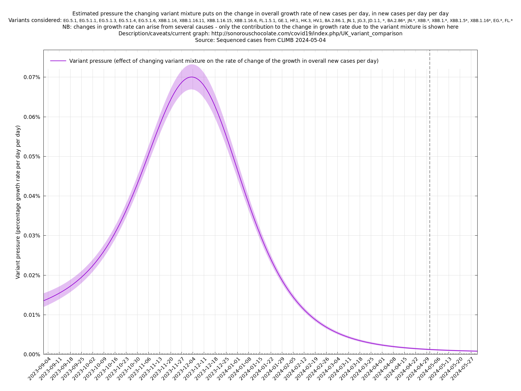
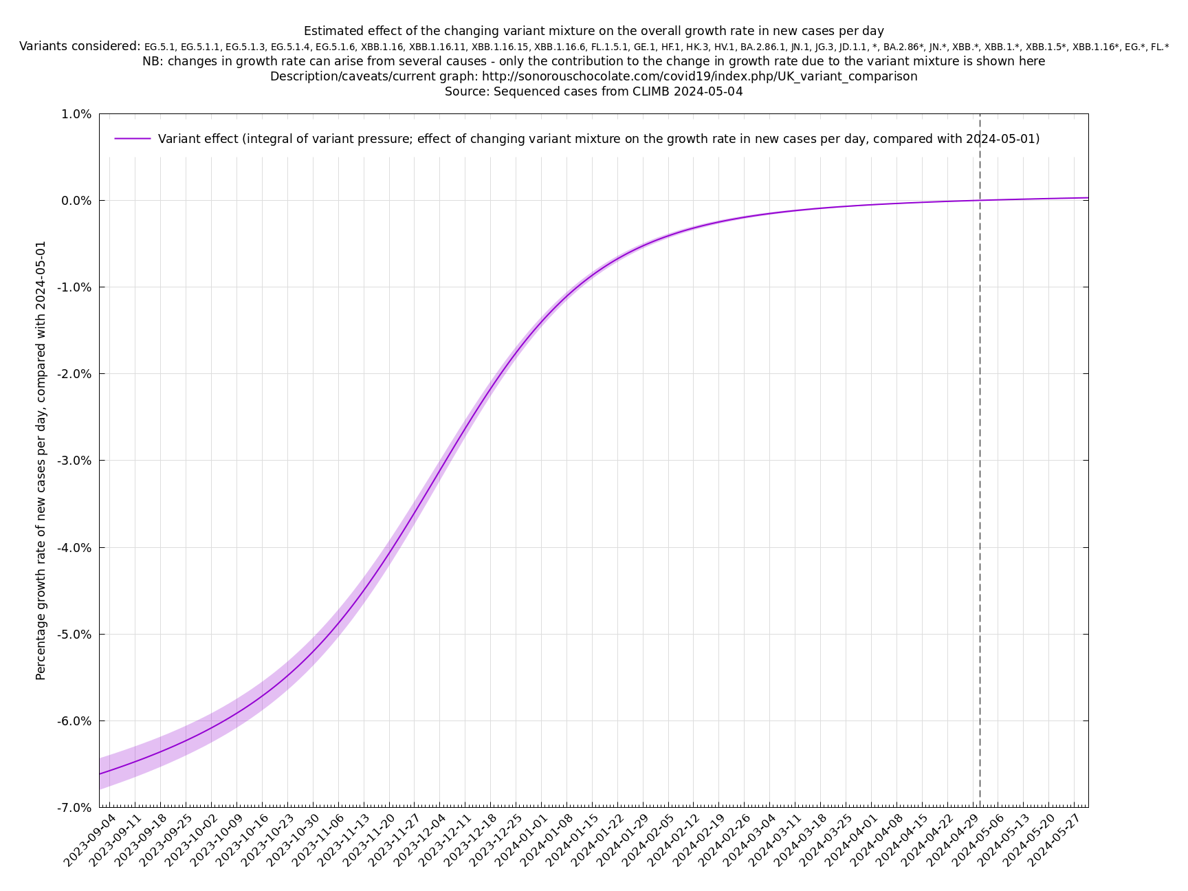
Another view of the same information is the integral of the above graph shown below (with an arbitrary vertical offset). This allows you to compare two days to see how much the changing variant mixture has increased the growth rate, and also provides an estimate of how much it will increase the growth rate a short time into the future, always remembering that this variant effect on growth has to be added to the general growth (or decline) of all variants to get the overall growth rate of the virus.
[Time of writing: 20 December 2023] Temporary underclassification issue for JN.1. Please ignore December data for the time being.
[Time of writing: 7 December 2023] JN.1 is now established as the most common single variant, though not yet more frequent than all other variants combined, and will contribute to an increase in infections over the winter. Its estimated growth advantage of 7.4% per day over the baseline variant is moderately high, though going by the crude "it's the square that matters" rule-of-thumb, it is only a quarter as bad as BA.5 which had a 14% or so daily growth advantage.
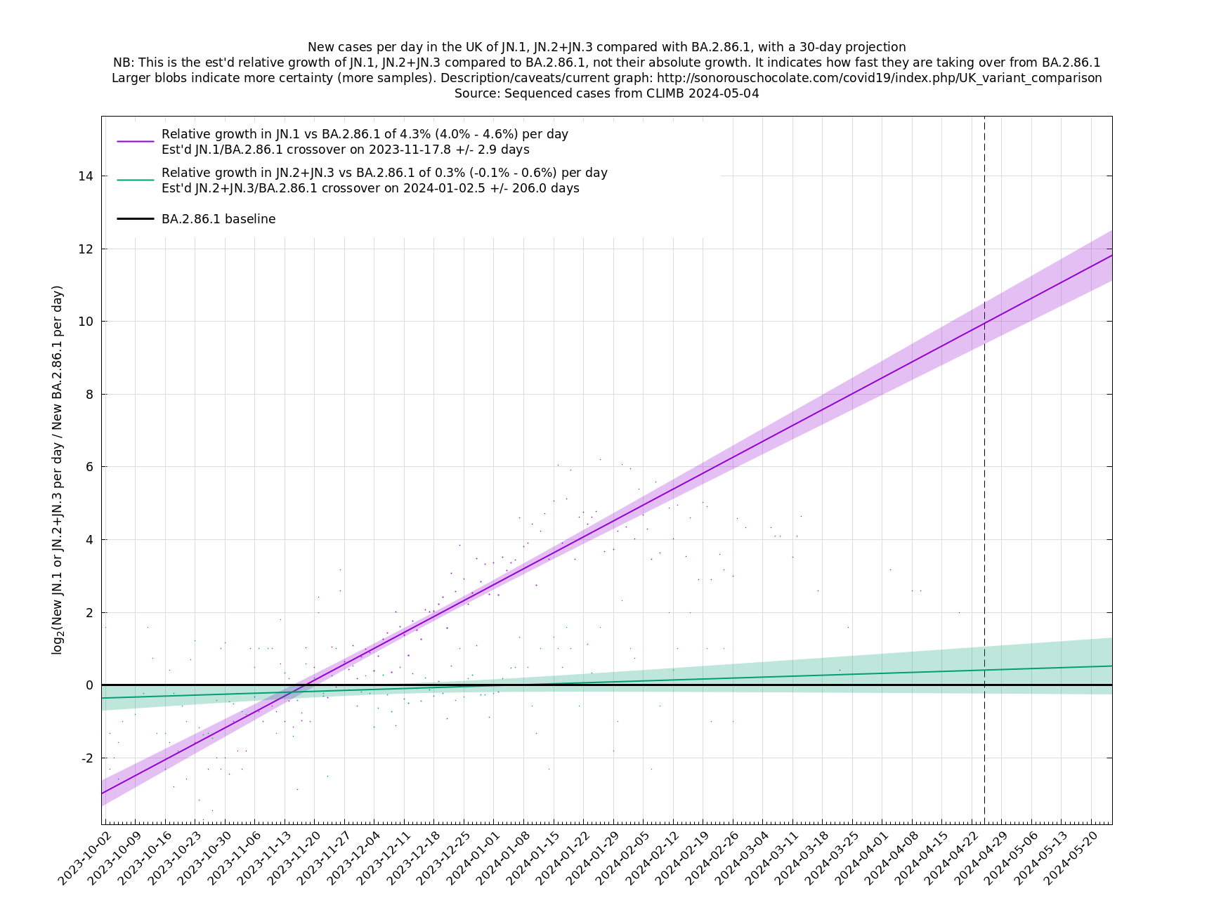
A y-co-ordinate of 0 corresponds to equal number of new cases per day of a variant compared to the baseline variant. The purpose of presenting it this way, with a particular chosen baseline variant, as opposed to several variants on an equal footing, is that it means we expect to get straightish lines to some reasonable approximation over a shortish time period (two months, say).
Description of variant pressure
Edit to add: it turns out the decomposition presented here is an example of Fisher's fundamental theorem of natural selection, where the fitness function of a variant is the relative growth rate for that variant, plus a variant-independent, time-dependent, global term. Fisher's statement in 1930 was that "The rate of increase in fitness of any organism at any time is equal to its genetic variance in fitness at that time", though this required interpretation as it wasn't a completely formal mathematical statement. See John Baez's paper for a mathematical exposition of the time-independent case.
For a new variant to make itself felt in the growth of all new cases per day, it has to do two things: it has to grow faster than other variants, and it also has to grow enough in relative terms to reach a decent proportion of all variants. The fact that its growth advantage is mentioned twice here means that it's the square of its growth advantage that's the important quantity in determining whether it will be able to have a significant influence within a reasonable time frame, say three months. (The first power of the growth advantage would measure what influence it has in a hypothetical infinite time frame, but that is unrealistic because after a few months it's quite possible that other new variants will have arisen and immunity will have shifted.) This means that there is a steep change in how much influence a variant has as a function of its growth advantage, because squaring a small quantity makes it really small. In practice this means that a growth advantage of 2-3% or so is small potatoes and isn't likely to cause a major change, whereas something like 10% (roughly the advantage the BA.5* family had over BA.2*) is pretty big and may well lead to a new wave of cases (though this depends on a number of other factors too).
We can quantify this variant effect more systematically with something I'm going to call variant pressure, for the sake of a name. (With apologies if this quantity already exists in the literature under a different name.) It measures the influence of variants on the change in growth rate of new cases, and its units are "per day per day" or "proportional change per day per day". More details about this in the technical section below, but just to mention, something slightly nice has happened here because we're able to cut the forecasting problem in two and isolate the piece due to variants - thus avoiding the difficult piece that depends on people's contact patterns, changing levels of population immunity, the weather, etc - and then predict that piece using only relative information about the numbers of each variant. That is, we don't need to know the overall number of infections, just the number of each variant that ended up being sequenced. That's nice because this relative information (like the number of new cases of variant A divided by the number of variant B) is much more stable and predictable than the absolute information (the number of actual infections of variant A).
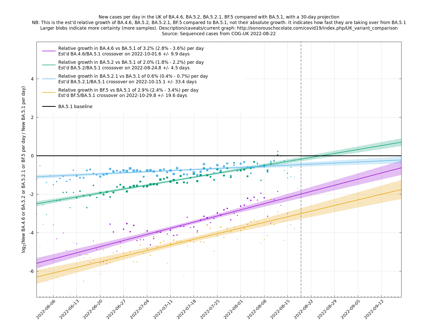
This relies on a number of assumptions, as detailed in the technical section below, but the most important caveat is that the process relies on identifying all the relevant variants for the time period in question. If a fast-spreading variant is missing from the list then the projection will only be valid up to the point that that variant reaches a noticeable proportion of all variants. In normal times, this would usually allow decent variant predictions maybe two or so months ahead, but at the time of writing (22 August 2022), there are a number of new fast-spreading variants arriving on the scene, so it's probably best to limit the prediction horizon to one month only. This in turn may indicate something about the growth of new Covid cases up to about two months ahead.
The graph below (not self-updating) shows how waves of variant pressure have come ahead of waves of infections, in each case by about four weeks. (The Spring wave was largely BA.2* and the Summer wave BA.5*.) Of course this doesn't of itself establish a causal relationship, but it is at least consistent with one. The variant pressure is only one component of changing immunity levels which are also reduced by immunity waning and increased by vaccination or infection.
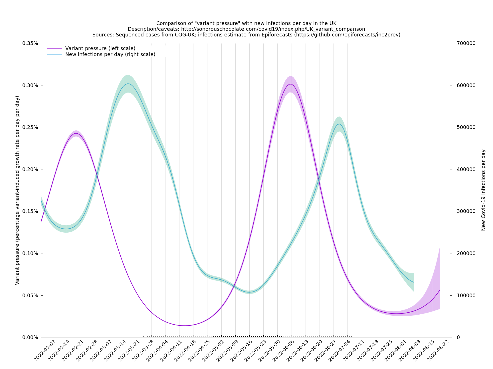
This graph was based on the collection of variants thought to be important for the period covered (February - August 2022). The area under the pink curve represents the change in proportional growth rate (of new cases per day). For example, the area from 2022-05-30 to 2022-06-13 is roughly 0.28%*14=4%, which means the proportional growth rate (of new cases per day) at 2022-06-13 is 4 percentage points per day higher than it would have been if the variant mixture hadn't changed between 2022-05-30 and 2022-06-13. It could be that the growth rate on 2022-06-13 was the same as on 2022-05-30, but if so, that would be because other effects, such as increased immunity in the population, have caused a reduction in the growth rate by 4 percentage points, thereby cancelling out the variant-caused growth rate increase.
Technical details
The input information (directly observed) is $$n_i(t)$$ = the number of sequenced variant $$i$$ at time $$t$$ (in units of days). Let $$n(t)=\sum_i n_i(t)$$ = total number sampled on day t.
As a matter of notation, let $$N_i(t)$$ = the number of infections of variant $$i$$ at time $$t$$, and $$N(t)=\sum_i N_i(t)$$, thought these are treated as unobserved.
The basic assumption is that $$n_i(t)$$ and $$N_i(t)$$ are both of this form: $$n_i(t)=\exp(a_i+b_it)f(t)$$ and $$N_i(t)=\exp(a_i+b_it)F(t)$$ with the same $$a_i$$ and $$b_i$$, at least locally in $$t$$. (Or more precisely, sampled from a distribution with these means, but we're not going to maintain this distinction here.) See assumptions section below for why we might expect this to work. An alternative form of the assumption is $$\frac{d^2}{dt^2}\log(n_i(t)/n_j(t))=0$$, and similarly for $$N_i(t)$$, and a more relaxed version would only require that $$\frac{d^2}{dt^2}\log(n_i(t)/n_j(t))$$ be "small", which leads to more general kinds of fits, such as splines. In any case, the linear approximation, $$a_i+b_it$$ is often (though not always), a good approximation locally (e.g., for a period of a few months), assuming we've accounted for all the relevant variants.
Note that $$a_i$$ and $$b_i$$ are defined up to the addition of overall constants, $$a$$ and $$b$$, since we can absorb $$\exp(a+bt)$$ into $$f(t)$$.
A key point is that $$a_i$$ and $$b_i$$, the relative growth and offset of each variant, can usually be accurately estimated, whereas $$f(t)$$ and $$F(t)$$ contain all the difficult stuff: they vary according to people's changing behaviour (contact rates, testing, isolating etc), immunity levels which can go up and down, propensity to test, sequencing capacity, day of the week, public holidays, the weather, and so on. That's why it's hard to predict the number of cases, but plotting $$\log(n_i(t)/n_j(t))$$ tends to give very nice straight lines (see e.g. historical graphs below). It's like a cheap blinded randomised control trial: the assumption is that everything is independent of what variant you are infected with, apart from the infectiousness of the variant.
We can estimate $$a_i$$ and $$b_i$$ using a multinomial fit, where you condition on $$n(t)$$ and for each $$t$$ assume that $$n_i(t)$$ are distributed multinomially with probabilities $$p_i(t)$$ proportional to $$\exp(a_i+b_it)$$. Another way to think of this in terms of data compression is that someone tells you each $$n(t)$$, and you have to output $$n_i(t)$$ as compactly as possible. This makes use of the readily-available information and throws away the hard-to-use information, because, as discussed above, the total number of sequenced cases, $$n(t)$$, can vary unpredictably.
The program used here, uk_var_comp.py, uses a Dirichlet-multinomial distribution, which is a slight generalisation of the multinomial distribution that can account for "overdispersion". It's a bit like: it does a multinomial fit, then looks at how well the data actually fits according to that model, and if that isn't very well, it adjusts its vision to be more blurry. Details in Dirichlet-Multinomial fit subsection. (Note that the method of fitting and the presentation of the result as variant pressure are two separate things. I.e., there is no particular need to use the Dirichlet-Multinomial method in order to form a variant pressure graph.)
Let $$Z(t) = \sum_i \exp(a_i+b_it)$$. From $$N(t)=Z(t)F(t)$$, we have \[\frac{d}{dt} \log(N(t)) = \frac{d}{dt} \log(Z(t)) + \frac{d}{dt} \log(F(t)).\] This separation suggests an interpretation:
\[\text{(proportional growth in infections) = (proportional growth in cases due to variants) + (proportional growth in cases due to everything else)}\]
$$Z(t)$$ is defined up to multiplication by $$\exp(a+bt)$$, so $$\frac{d}{dt}\log(Z(t))$$ is defined up to addition of a constant, and \[P(t)=\frac{d^2}{dt^2}\log(Z(t)),\] the quantity that was called "variant pressure" in the previous sections, is well-defined and has the interpretation as "change in proportional growth in cases due to variants", by way of this equation: \[\text{(change in proportional growth in infections) = (change in proportional growth in cases due to variants) + (change in proportional growth in cases due to everything else)}.\]
Note that \[\frac{d}{dt}\log(Z(t)) = \sum_i b_i\exp(a_i+b_it) / Z(t),\] which has the interpretation as the expected value of the growth, $$b_i$$, if you choose a random variant at time $$t$$ with probability $$\exp(a_i+b_it)/Z(t)$$.
And \[\frac{d^2}{dt^2}\log(Z(t)) = Z(t)^{-1}\sum_i b_i^2\exp(a_i+b_it) - \left(Z(t)^{-1}\sum_i b_i\exp(a_i+b_it)\right)^2,\] which has the interpretation as the variance of the growth, $$b_i$$, if again you choose a random variant at time $$t$$ with probability $$\exp(a_i+b_it)/Z(t)$$.
One nice thing is that $$P(t)$$, which can be interpreted as change in growth rate due to variants, is a function of only the $$a_i$$ and $$b_i$$ (up to an overall constant each), for which estimation/prediction tends to be fairly accurate, and doesn't rely on estimating the $$f(t)$$ or $$F(t)$$ bit, which is difficult to do.
Another nice thing is that $$P(t)$$ doesn't actually rely on the decomposition $$N_i(t)=\exp(a_i+b_it)F(t)$$ to define it, only to interpret it. That means that you can define $$P(t)$$ in a context where you don't assume that the variant-dependent bit has the form $$\exp(a_i+b_it)$$. In general, if $$p_i(t)$$ is any smooth fit of $$n_i(t)/n(t)$$, (generalising $$p_i(t)=\exp(a_i+b_it)/Z(t)$$, which we won't use) then we can define
\[P(t)=\sum_i p_i(t)^{-1}\left(\frac{dp_i(t)}{dt}\right)^2.\]
Why does that definition make sense? Because it is equal to \[\sum_i p_i \left(\frac{d}{dt} \log(p_i(t))\right)^2 - \left(\sum_i p_i \frac{d}{dt}\log(p_i(t))\right)^2,\] which is the variance of $$\frac{d}{dt} \log(p_i(t))$$ if you choose variant $$i$$ with probability $$p_i(t)$$. Since variance is unchanged by adding an overall constant, this expression is also the variance of $$\frac{d}{dt}\log(p_i(t)g(t))$$ for any function $$g(t)$$, which means for any $$t$$, if there is any decomposition (which you don't need to work out) that puts $$p_i(t)g(t)$$ locally in the (approximate) form $$\exp(a_i+b_it)$$ then $$P(t)$$ will be (approximately) equal to $$\sum_i p_i(t)b_i^2 - \left(\sum p_i(t)b_i\right)^2 = \frac{d^2}{dt^2}\log(\sum_i\exp(a_i+b_it))$$, as before.
For example, if you are doing a spline fit instead of just $$\exp(a_i+b_it)$$, say $$n_i(t)=\exp(\sum_j b_{ij}s_j(t))f(t)$$, where $$s_j(t)$$ are spline basis functions ($$s_0(t)=1$$, $$s_1(t)=t$$ would recover the simple linear version), then you can define $$p_i(t)=\exp(\sum_j b_{ij}s_j(t))/\sum_i \exp(\sum_j b_{ij}s_j(t))$$, and $$P(t)=\sum_i p_i(t)^{-1}\left(\frac{dp_i(t)}{dt}\right)^2$$.
Subsection: discussion about basic assumption
As mentioned above, what usually makes $$n_i(t)=\exp(a_i+b_it)f(t)$$ a good approximation is that (when it works) it's a bit like a blinded randomised control trial, the idea being that everything is independent of what variant you are infected with, apart from the infectiousness of the variant. Recapping these assumptions plus some others:
- People's behaviour (contacts, testing, isolating etc) is the same regardless of what variant they are infected with.
- Sequencing probability is independent of variant.
- There is no Simpson's paradox (subpopulation confounding: where one variant is concentrated in a region or age group or other subset of the population with a different overall growth rate).
- The variants have the same generation times (and more generally, variants' infectivity as a function of time since infection is meant to differ only by an overall constant)
- The pool of susceptible people is the same for each variant, or at least there is no big differential (one variant compared to another) change in immunity over the time period which is being studied
Broadly speaking we'd like to say that, $$N_i(t)$$, the number of new infections of variant $$i$$ at time $$t$$ behaves something like \[N_i(t)=R_i N_i(t-T)S(t),\] where $$T$$ is an effective generation time and $$S(t)$$ is the (common) number of susceptibles at time $$t$$, multiplied by behavioural factors (contact rates etc) common to all variants. This ends up as roughly $$N_i(t)=R_i^{t/T}S(t)S(t-T)\ldots N_i(0)$$, i.e., $$N_i(t)=\exp(a_i+b_it)F(t)$$, which is the basic assumption. (The generation times don't necessarily have to be the same, but that is the easiest form to reason with.)
These are a lot of assumptions, and we can't be sure they will hold, but you seem to get pretty good straight lines a lot of the time if you plot $$\log(n_i(t)/n_j(t))$$ (see e.g., historical fits), which is some evidence that the assumptions are reasonable.
One occasion where this relationship appeared to go wrong was the Delta to Omicron transition in December 2021, as remarked on here. This may have been partly due to a different generation time of Omicron, in conjunction with people significantly cutting down on contacts. If so, then we probably won't see such this particular effect again, as people have not been changing their contact patterns en masse in response to Covid-19 since around Spring 2022. This more homogeneous behaviour may also reduce the effect of a Simpson's paradox effect.
Subsection: Dirichlet-Multinomial fit
If $$p_i(t)$$ is the probability of variant $$i$$ at time $$t$$, as given by some fitting process, such as $$p_i(t)=\exp(a_i+b_it)/\sum_j\exp(a_j+b_jt)$$, then the multinomial probability of $$n_i(t)$$, conditioned on $$n(t)$$, is
\[\prod_t\left\{\binom{n(t)}{n_1(t)\ldots n_k(t)}\prod_i p_i(t)^{n_i(t)}\right\}.\]
The above multinomial distribution is (dropping the $$t$$ suffix for the moment) equivalent to each $$n_i$$ being an independent Poissons of rate $$\lambda p_i$$, conditioned on them all summing to $$n$$. The negative binomial distribution is a popular way to get a family of distributions that generalises the Poisson in such a way that gives a parameter that allows control over the variance divided by the mean. If $$n_i$$ are independent negative binomials, $$\text{NB}(\lambda p_i,p)$$, with a common $$p$$ (success probability) that won't matter and a parameter $$\lambda$$ to be decided on later, then conditioning on their sum being $$n$$ gives a Dirichlet-Multinomial distribution with parameters $$n$$ and $$\lambda p_i$$.
The variance of $$n_i$$ is then equal to $$n p_i(1-p_i)(n+\lambda)/(1+\lambda)$$, a factor of $$(n+\lambda)/(1+\lambda)$$ bigger than it would be under a multinomial distribution. The present model (used by uk_var_comp.py) has a single overdispersion multiplier, $$m$$, and $$\lambda$$ is chosen to set each factor of $$(n+\lambda)/(1+\lambda)$$ equal to $$m$$, i.e., $$\lambda=(n-m)/(m-1)$$. So in full, the model has parameters $$a_i$$, $$b_i$$ (defined up to overall additive constants) and $$m$$, and the likelihood is defined by $$p_i(t)=\exp(a_i+b_it)/\sum_j\exp(a_j+b_jt)$$, $$\lambda(t)=\max((n(t)-m)/(m-1),0.001)$$, and then for each $$t$$, $$n_i(t)$$ are distributed Dirichlet-Multinomial with parameters $$n(t)$$ and $$\lambda(t)p_i(t)$$.
A justification for adjusting the extra parameter $$\lambda(t)$$ in such a way as to keep $$(n+\lambda(t))/(1+\lambda(t))$$ constant, is that a variance multiplier, $$m$$, is the effect you'd expect from clustered observations: if observations tended to come in bunches of size $$m$$. In practice, though, the extra parameter $$m$$ "blurs" the distribution and gives the model a general way to cushion the impact of any aspect of it that is not quite right. It often seems to want to use values of $$m$$ between $$2$$ and $$4$$, which, roughly speaking, widens the credible intervals by a factor of between $$\sqrt{2}$$ and $$2$$. For what it's worth, and as far as I can judge by "feeling", the credible intervals so obtained do generally look like plausible representations of the uncertainty that is present.
Graphs below featuring disappearing or less significant lineages are no longer updated
(Note the y-scales below use natural logs.)