LondonTraffic
Lockdown was introduced in the UK on 2020-03-23 though the actual response to it was a little more gradual. Some activity was reduced voluntarily in the preceding week or two (unfortunately not shown in the graph because I only thought to collect the data from around 21 March), while on the other side, the full effects were not felt for another week: we see the quietest period 2020-03-30 - 2020-04-05. From then on there is a gradual increase in activity. Official easing of Lockdown in England began on 2020-05-11, though we can see from the above graph the pattern of rush hour, indicated by spikes in the morning and afternoon, had been establishing itself from at least a week before that. (Friday 2020-05-08 was a public holiday incidentally.)
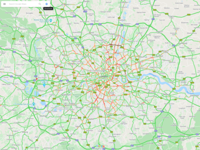
The above graph is derived from Google map's traffic congestion information as colour-coded in images like this one
by counting the number of pixels that represent the levels of congestion in Google map's system (green, orange, red, dark red).
The raw data file is available here (updated daily).
The programs used to make it are available in this repository.

