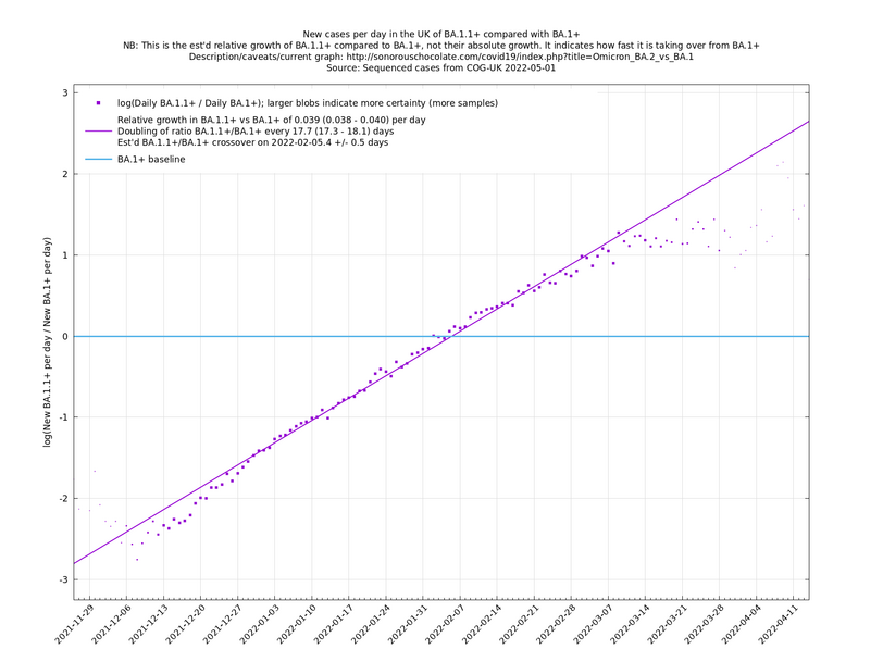
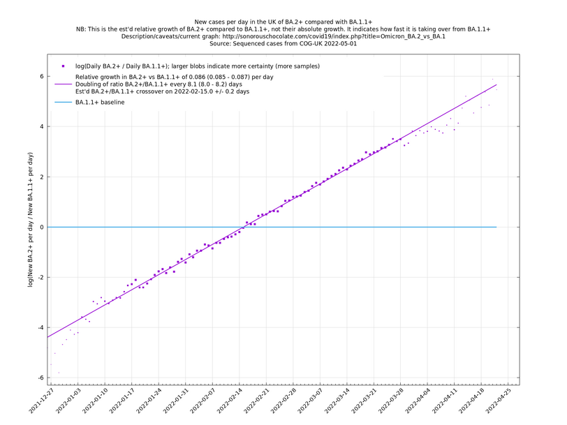
UK variant comparison
These graphs should auto-update every few days, according to when there is new sequence data from COG-UK. You may need to hit shift-reload or some such to defeat your browser's cache.
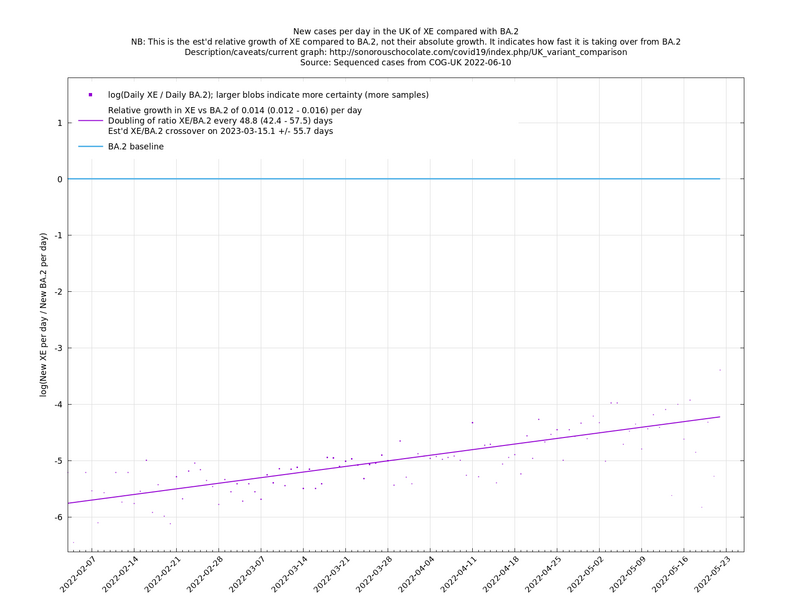
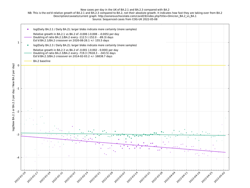
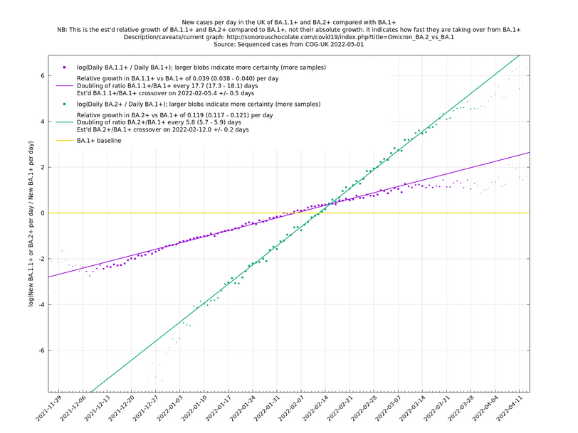
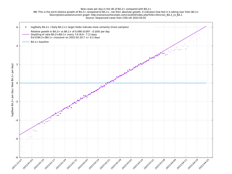
These graphs compare one or more variants with another "baseline" variant. A y-co-ordinate of 0 corresponds to equal number of new cases per day of a variant compared to the baseline variant. The purpose of presenting it this way, with a particular chosen baseline variant, as opposed to all three variants on an equal footing, is that it means we expect to get straight lines to some reasonable approximation.
Note that the growth estimates here rely on sequenced cases, of which there are about 10,000 per day, being representative of infections. This assumption may or may not hold, though arguably a good linear fit over an extended period (say, several weeks) constitutes some evidence in its favour, because many distortions you may think of, such as preferential sequencing of a particular variant for a limited time period, or different growth rates in different subpopulations, would often have the effect of knocking the relationship off being linear.
Update 2022-04-07: The BA.* lineages are now classified into many more sublineages. For the purposes of these graphs, a suffix of '+' means that all sublineages are included along with the principal lineage. For example, BA.1+ includes BA.1 and BA.1.17. In the situation where a sublineage would be included under more than one of the lineages being compared, it is assigned to the most recent ancestor. For example in the graph of BA.1.1+ vs BA.1+, the sublineage BA.1.1.7 is assigned to BA.1.1+, not BA.1+. (The older graphs involving only BA.1+, BA.1.1+, BA.2+, all use the '+' suffix because they are continuations of graphs that began in January 2022 when BA.1, BA.1.1 and BA.2 weren't subdivided. Doing it this way allows you to see what was known in the past.)
Update 2022-04-07: Now including XE vs BA.2. The graph below suggests XE may be declining, or at least not increasing, relative to BA.2, which would obviously be good news, though it is a bit too early to be sure of this. (The usual caution regarding statistical confidence applies: the confidence interval measures the uncertainty within the given model, which in this case does at least try to account for samples not being independent, but it is possible that there are other non-modelled effects such as XE being in areas of the country where people are meeting each other less.)
Program used for analysis: uk_var_comp.py.
